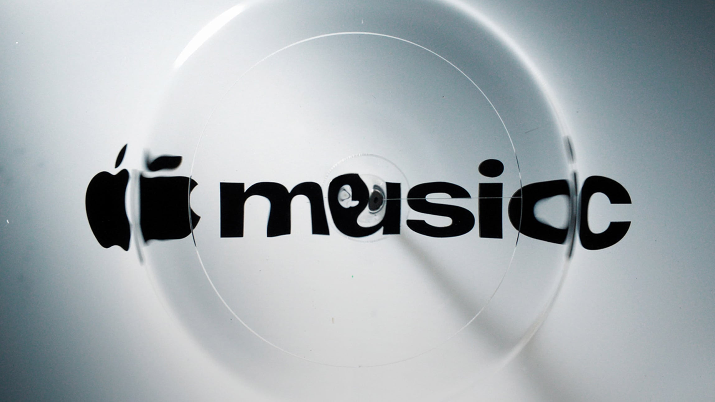
Apple Music unveils logo that was physically made by sound
News Source : Dezeen
News Summary
- Apple unveils first rebrand for its Apple Music service.
- The logo has a wave-like aesthetic that was created through a physical process.
- It was made in collaboration with musician Fred Again by passing sound waves through a pool of oil.
- The Apple Music identity was teased earlier in the month, when the company unveiled its music venue in Battersea,.
- The logo is placed on the wall within the venue, which has an industrial aesthetic to match the renovated power station it sits within.
- The typology of the Apple Music logo has been amended to align with wider Apple visual identities.
- Sat alongside the apple icon, the M in music has been made lowercase.
Technology brand Apple has revealed the first rebrand for its Apple Music service, which was made in collaboration with musician Fred Again by passing sound waves through a pool of oil.















 Never miss a story from us, subscribe to our newsletter