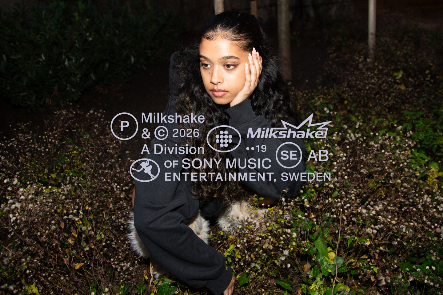
Studio Herrstrm gives disruptor music label a lightning logomark and palette made of milkshake flavours
News Source : Itsnicethat.com
News Summary
- Drawing on the familiar forms of car window stickers, Studio Herrström’s gives music label Milkshake the visual structure it needs to scale.
- It feels both extra and ordinary; harbouring a satisfying graphic tension between default, commonplace visual cues and florid forms.
- The brand has real energy and mobility behind it, but is equally grounded in simplicity and structure.
- The architectural nature of the identity, coupled with its razzle-dazzle, will mean it can support both artist and agency alike as it scales.
This contrast comes directly from the labels origin story, with its namesake being first suggested by the founding team during a drive.















 Never miss a story from us, subscribe to our newsletter