Fulham F.C gets a brand refresh built on handrendered lettering found on the walls of its stadium
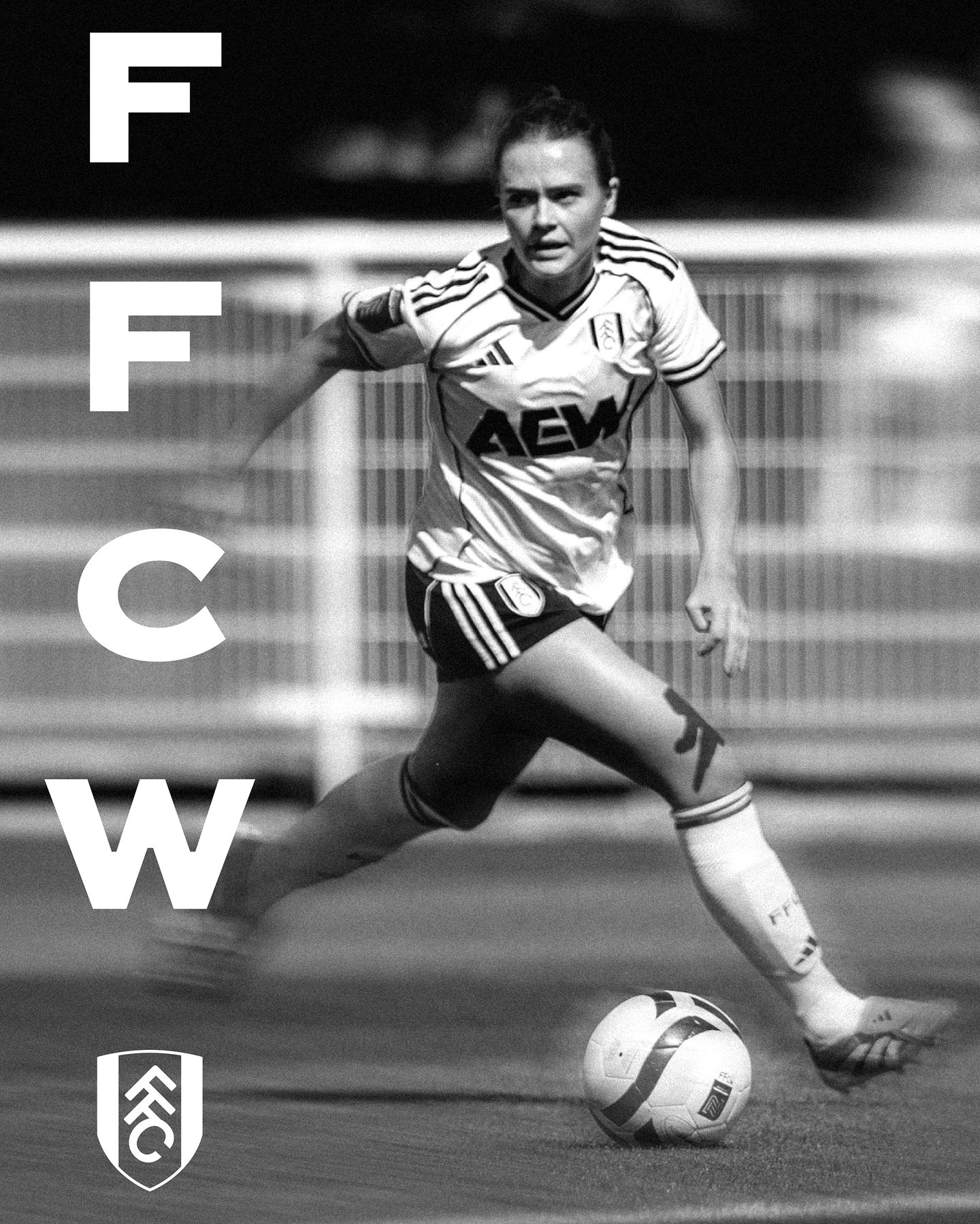
News Source : Itsnicethat.com
News Summary
- Creative agency Music, in collaboration with F37 Foundry, translate the architectural references to Fulham and the heritage of Fulham as a football team into a functioning type system.
- Kicking off the identity is the development of a bespoke typeface called FFC Original, which borrows from a piece of hand-rendered lettering found within Craven Cottage.
- Its simplicity, strength and character bridges heritage and the contemporary, positioning Fulham F.C as a club that recognises and honours history whilst having the flair to move seamlessly into the future.
- Another element of the refresh is the club’s 2026/27 away kit campaign, which is inspired by the language of the 90s with a film that combines new typography with an irreverent approach.
Craven Cottage gave us the answer. The lettering within the stadium had all the character we were looking for it was genuinely Fulham, rather than something applied to Fulham.














 Never miss a story from us, subscribe to our newsletter