Kinetic Typography Motion Design Words Move Like Bodies
News Source : Abduzeedo.com
News Summary
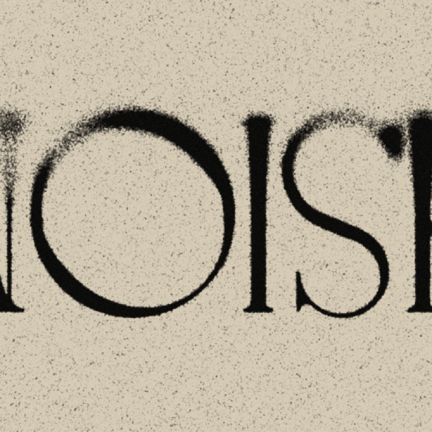
- The four sequences in this series treat characters as physical objects.
- Letters accelerate, collide, resist, and release within a disciplined spatial grid.
- The visual system relies on a restrained color palette to emphasize structural form.
- This collection sits between title sequences and social media formats.
- In 2026, motion designers must balance these formats for broadcast and digital campaigns.
- The studio's UK-based team uses these pieces to show how weight influences type.
- With over fourteen thousand appreciations, the project shows a growing appetite for physical motion design.
Knife Motions second collection demonstrates how kinetic typography motion design can transcend programmatic software presets to feel like physical mass.